BRANDING
01 ENTERWELL BRAND
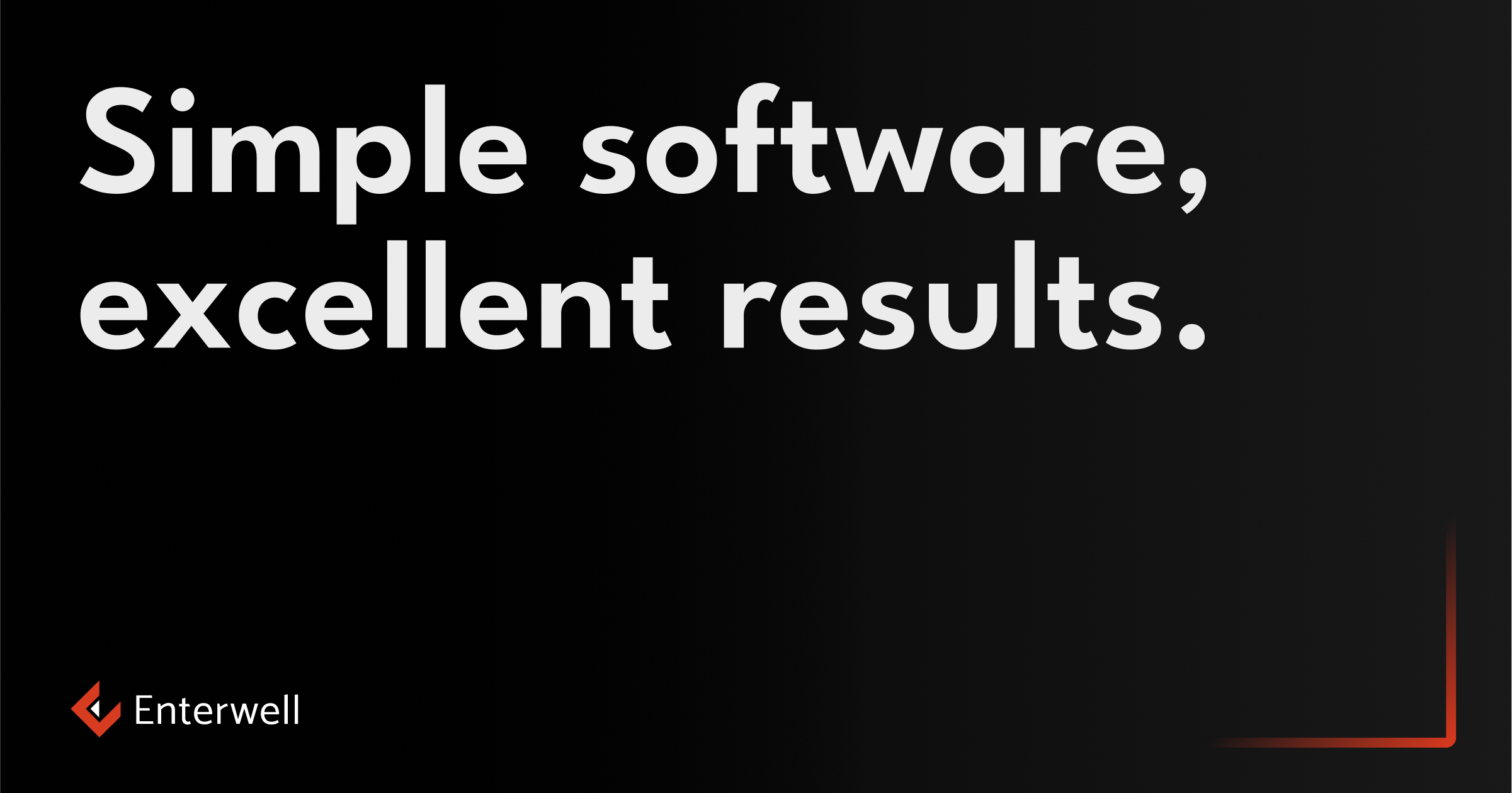
Enterwell brand is based on its dark color pallete with accent red, bold, readable typography and its simple decoration elements.
02 COMMUNICATION
Tone of voice
The way we communicate and present ourselves
- Educational, but we are not trying to be smart
- Goal oriented, but we are not critical
- Clear, but we are not cold and distant
- Supportive and interesting, but we are not clowns
03 COMMUNICATION
Logo application
Primary use of the logo is Logo horizontal, but depending on your design needs, you can also use either vertical logo, logotype (only text) and logomark (symbol).
Download all variationsLogo horizontal
Primary logotype which should be used for print and digital use. Use this where ever you need to highlight logotype.
View all variationsLogo vertical
Use vertical logo on really narrow surfaces when horizontal logotype would be too small.
View all variations
Logotype
Logotype is used in special cases, such as when the logomark is used as a design element.
View all variations
04 COLORS
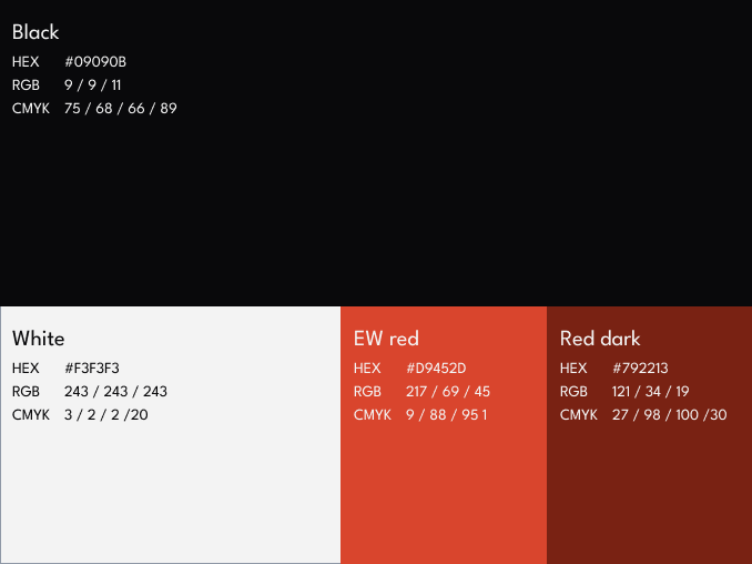
Colors
Enterwell’s color palette consists oh primary black and red, followed with white and dark red. In combination with different red and grey gradients they build our color system.
Primary colors
Black is the most used color, followed by white, while red shades are used only for color accents.
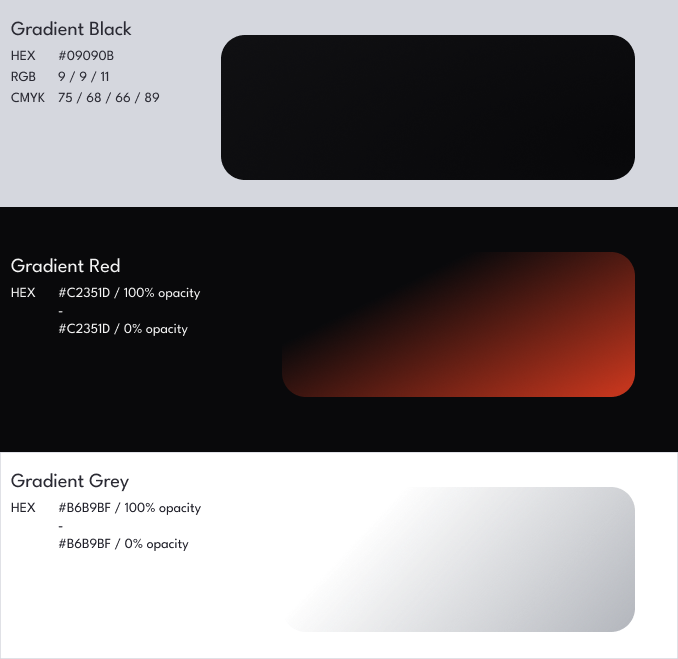
Gradients
Black gradient is used as a background, while red and grey gradients are always used on a black background.
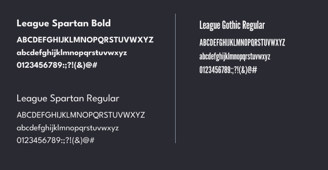
05 TYPE
Used typography
Our primarily used typography is League Spartan which is used for most of the headlines and all of the smaller point sizes and body text.
Another used typography is League Gothic which is used for headlines with more of a decorative purpose.
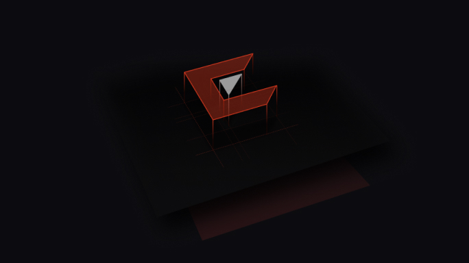
06 WALLPAPERS AND COVERS
Decorations in use
Enterwell brand offers a range of different visuals that can be used for different purposes such as wallpapers, covers for social media, etc.
They are based on our Enterwell pattern which can vary in the color of the pattern, its positioning and whether it has logo or it is just plain decorations.
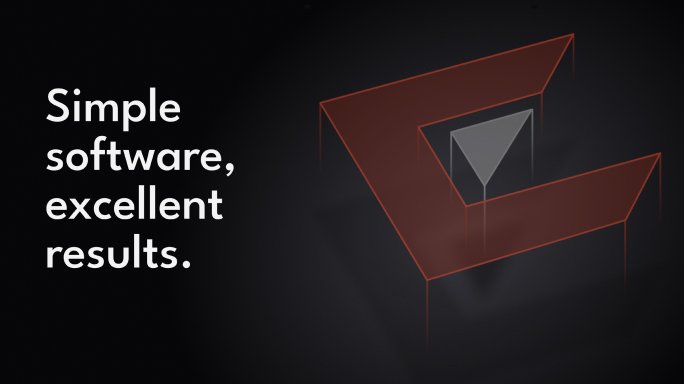
07 TYPE AND DECORATION
Typography on cover images
When it comes to cover images, you can use combination of type and decorations or images. If border can be easily noticed and doesn’t look bad on the background image, it should alaway be used.
Text on cover can have different combinations of headlines, body text and subheadline.