
The designer’s nightmare before Christmas

This time of the year is a real treat for “color nerds”.
While we can get carried away with the spirit of Christmas, choosing your color palette carefully when designing is the best gift you can give to the users of your digital products.
During the Christmas holidays, we see a lot of red and green together. Green trees with red ornaments, strings of green and red lights, elves outfits, gift wrapping paper, Christmas cards, posters, TV ads, socks and (ugly) sweaters, candy canes… even mistletoe with a red ribbon – all colored with that unique color combination.
These two colors will always remind us of Christmas, but what does color theory say about combining them?
01 color theory
Short reminder on color theory from elementary school days
There are three primary colors – red, yellow and blue. In the purest definition, primary colors are colors that cannot be created by mixing any other colors. Existing purely as they are – red, yellow and blue – are the source of all other colors.
The mixtures of primary colors are called secondary colors. So, if you mix red and yellow – you get orange. If you mix yellow and blue – you get green, and finally, mixing blue and red – you get purple.
Still wondering how all this relates to Christmas and reasonable designing for users? Well, before designing with primary colors – like red, which is essential for all things related to Christmas – it should be taken into account that we need to, first, understand their roles on the color wheel.
At the end of the day, mixing a primary with a secondary color such as red and green results with a shade of brown and you don’t want your UX or UI to look crappy either.
02 Color Wheel
Do not treat the color wheel as a wheel of fortune
The color wheel illustratively shows the relationships between all colors in the spectrum. The secondary colors are located between the colors from which they are made (primary).
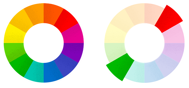
Colors sitting across from each other are called complementary colors. Putting these next to each other creates great contrast and visual interest, however, they can easily become overpowering. So it’s important to use them carefully.
The color wheel should never be treated as a wheel of fortune. There is more to it than just randomly picking a color combination to use.
When combined, red and green create a vibrancy, which can feel as if the both colors are simultaneously fighting for your attention. Try placing red and green on top of each other. You will notice that red looks as if it is “floating” on a green surface – and green seems to look like a “dent” on a red surface.

Very vibrant color combination.

How people with Deuteranopia see it.
In web design, a very saturated color combination can be very disorienting, since legibility plays a big role in navigation and overall understanding. If you use a vibrant color combination, such as red and green in web design, you risk a bad user experience. Why? Well, convex shapes might signify a button or other CTA elements, but that alone, without the right color combination, means little.
Users might look away, since the combination is frankly hard to look at and quite impossible without eyestrain. That applies even more to on-screen designs, where the brightness of the screen itself plays a big role in perceiving color vibrancy. The brighter it gets, the more vibrant it goes.
03 ACCESSIBILITY
Design accessibility or “no go” colors
Did you know that 300 million people in the world are color blind? That means that one in 12 men, and one in 200 women see colors differently, and people working with colors should take that into account.
There is a type of red-green color blindness characterized by the inability to distinguish red and green pigments, which is called deuteranopia. People with this type of color deficiency see red and green like it’s the same color, especially if the hues have high saturation. Needless to say that, in any field of design, this combination must be thought through.
Instead of attracting users’ attention, vibrant color combinations put them off and you don’t want users to just close the browser tab or application.
Here are a few tips on how to use it properly.
Don’t assume colors will signal emotions by themselves. If you’re using red to signal some kind of warning, consider adding another symbolic element to get the point across.


If your form validation error is using only color and does not have an additional element or helper text, colorblind people will not know which form field is in an error state. Solution: Add other visual indicators of validation status — ideally both an icon and a text label.
04 red-green ALTERNATIVES
How to fight red-and-green battles
1. Play with color palettes and different tones of colors
Try replacing your red-green designs with a monochromatic color palette with high contrast between the colors. Using various tones of just one single color instead of multiple colors is the most reliable way to avoid color blindness issues and bad user experiences for all of us.
Minimalism is already a burning topic these days, so try not using vibrant color combos. They are just too aggressive to the viewers’ eyes.
If a monochrome combination doesn’t meet the visual requirements of the project and you still need to use complementary colors in your design, try picking different tones of chosen colors on the color wheel to reduce vibrancy between them.
For colorblind users, you can make this scenario slightly better by ensuring that the luminosity of the hues you choose is clearly different. Make sure one button is dark and saturated (low luminosity), and the other one is light and desaturated (high luminosity).
2. Choose different styles for your design components
Using red and green for primary and secondary buttons in forms can lead to confusion:
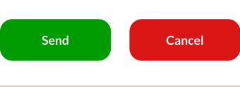
Example of two buttons of the same style.

How people with Deuteranopia see it.
Make it clear which is the primary and secondary action using distinct button styles, for example, your main CTA button should be fully colored while the secondary one can be outlined (“ghost” button).

Example of two distinct button styles.

People with deuteranopia see a clearer difference.
3. Find a sense of balance
The sense of balance in your design can be inspired by these few tips:
- Pick just one dominant color for your design and use the rules of color harmonies to find other colors that work as accents or smaller details.
- Use just a few colors for simple, but bold designs.
- Install color accessibility plugins for the design tools you use. Figma, Sketch, Adobe XD and others have several plugins that can enhance your color choices and help create better contrast for a user-friendly design. Beside plugins, there are individual color contrast and accessibility evaluation tools out there.
4. Use color in between
Sometimes, the simplest solution is the best solution. If you need to deliver a Christmas design with red and green, at least add white (or some other neutral color) between them to reduce conflict.
It will prevent everyone’s eyes from bleeding and provide you with satisfied users. See how Heineken® deals with red-and-green challenges.
05 WITH A BOW ON TOP
Let’s wrap it up 🎀
Color is by far the most discussed topic in everyday design work I would say. Carefully merging complementary colors is one of the first rules they teach us about color theory.
Before you start designing, think about the end users who will interact with the product in question. It’s ok if Christmas holidays get you into the red-and-green mood. Be wary of all those trendy vibrant combinations you found on design platforms and always keep in mind that dazzling color trends will pass, just like the Christmas snow.
P.S. Did you know that the color wheel was invented by Isaac Newton?


