Pattern designs: Attraction or distraction?
Every holiday season beautiful Christmas decorations and colorful patterns pop up all around us and it makes us think about what a huge influence they have on web design.
Indeed, decorative images in digital products can be quite significant for the user experience.
You know that moment when you find the perfect gift for a loved one and it doesn’t feel just right until you find the perfect wrapping paper too? You are not just giving a present, you are evoking an emotion, trying to make the whole experience of receiving a gift special.
Well, the same goes for designing a website. Decorative background images can be a powerful tool that can enhance the whole user experience. In this edition of “Designing Christmas” special we are looking at the possibilities of web design with patterns and the ways in which they can impact your user experience.
01 pattern or pattern?
Design patterns vs pattern designs
A web design pattern is a set of guidelines for designing a user interface component. In other words, it’s a reusable solution to a commonly occurring problem in everyday digital interaction. Term pattern design means that the elements of a certain design repeat in a predictable manner.
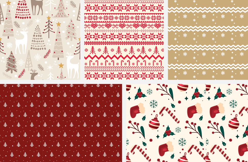
We find pattern designs in all areas of art – from interior and graphic design, through fashion to architecture. But, how pattern design takes place on the web, depends on the emotions we want to evoke in users.
Besides that, when choosing the right pattern design you must consider the performance of the devices on which it will be displayed as well as the grid resolution of the pattern.
02 No distractions
Making pattern design unobtrusive and meaningful
Imagine you need to design a website with a festive look and feel. The fonts and colors are, of course, very important, but what about background images? There are so many different ways in which you can approach it – from attractive color gradients, unique illustrations, striking patterns, videos, to a single image that occupies the entire screen. Each one leads to a different set of benefits for users. If you choose a pattern style for your website background, never underestimate the power of patterns regarding a website content.
Avoid using cluttered images for your website background, or the background will swallow the content.
As you may know, today users want to go about your content with minimal effort. They do not read, they scan. Graphic backgrounds are great for visual storytelling and capturing users’ attention, but make sure that it never distracts them from the main content of the website.
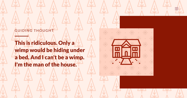
If you set up the website background incorrectly, it can interfere with the visual hierarchy and distract users from the rest of the content. When your background is discreet, it can take your design to the next level and immerse users in your product.
03 Signed, sealed, delivered
Delivering pattern designs to developers
Did you know that, on average, images take up most of the internet data needed to load a web page? That’s why a good developers hand-off is one of the most important aspects of the entire design process.
Patterns are useful for website development, allowing developers to recreate the intended design by using smaller images which are only a few KB in size.
It is better to fill a background with a lot of smaller images than one large image, which can be over 1 MB in size. So, during hand-off, you should split your (large) pattern image into a smaller image that consists of all the visible elements, which can then be reused in a repeated manner.
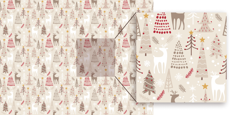
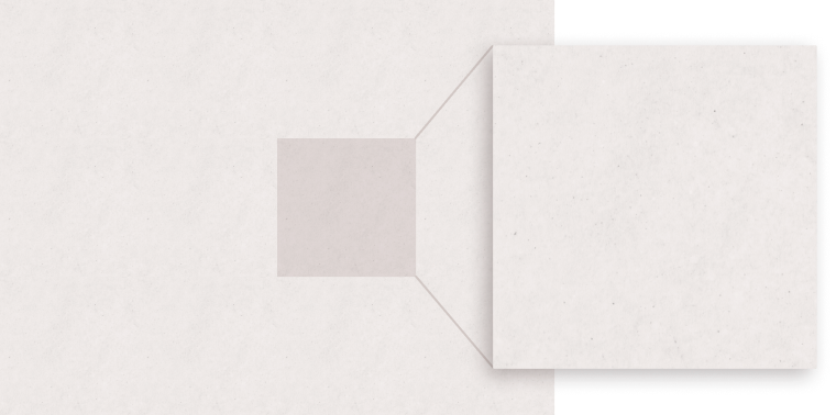
The advantage of working with patterns also applies to various photos of textured backgrounds that designers often use to cover a large part of the website as some kind of background for other elements. To avoid the use of large images that can significantly slow down page loading, such textures should also be provided as a single small repeatable image.
Repeated graphics are a good strategy for responsive design as they fit all screen resolutions easily. Patterns are repeated indefinitely either horizontally and/or vertically with smooth transitions at the section edges when expanded due to different resolutions.
04 Background
How pattern backgrounds collaborate with other design components
1. Color harmony
When designing a website with patterned backgrounds, make sure the color palette of your pattern is harmonious and that the colors of each individual element within the pattern are well balanced.
Why? So the pattern doesn’t draw too much attention from the text and images that convey the main message.
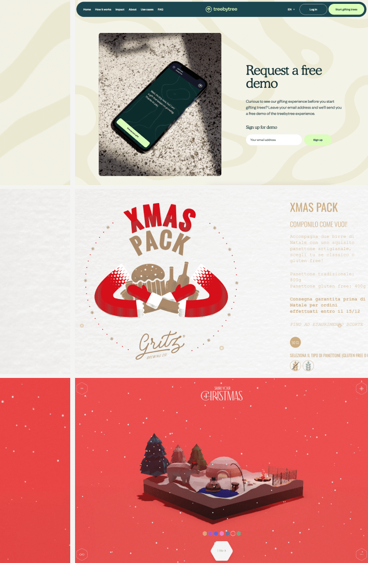
Also, don’t forget that monochromatic background patterns can greatly facilitate the positioning of other design elements. The reduced amount of colors that make a background, allows more important elements to come to the fore, such as typography and images. So, consider designing with monochromatic color palettes too!
2. Readable typography
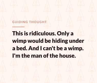
When placing text on any type of a pattern design background, consider whether that affects readability. One way of avoiding lack of readability is to try to reduce the intensity of pattern color by selecting another one, maybe a color that’s lighter and softer.
If a pattern design consists of more than one color – another good direction of designing with stylish graphics is to use a large percentage of transparency to slightly blend the entire pattern with the core background color. That way, the text will still be legible and you could still keep your decoration elements.
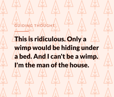
❌ Illegible
✅ Legible
However, you can always use patterns as section dividers only or stand-alone images next to other visual elements, without any conflict.

05 conclusion
Let’s repeat 🔹🔸🔹🔸
Stylish graphics can complement your website, but only if used correctly. Designers in general, need to make sure that the content they design is concise and clear, even if they get carried away by tacky Christmas decorations.
Most importantly, design needs to be easily scanned to provide a good user experience that will keep the user interested.
Did you know that not all wrapping paper is paper?
Some are plastic-based due to additives such as glitter and metallic finishes. To find out if wrapping paper is recyclable, you can do a “scrunch test” by squeezing it into a ball.
If it keeps the ball shape, then it can be recycled. If it springs back to a flat form, then it cannot.
