How Christmas typography stole readability
It all started with sending Christmas cards, handwritten in ink. A long time ago.
The authors expressed their best wishes in beautiful handwriting, decorated with the art of calligraphy.
How do we look at the text today, in the digital era? Do designers focus more on the decorative part of typography or do they aim at its key role – conveying a message to users?
01 CHRISTMAS FONT
Go ahead and type “christmas font free download”.
Press enter. Scroll down, back up and down again.
Pick the one you like the most, perhaps the tackiest one. Okay, download it and install. Now you can start designing Christmas motifs.
Easy peasy, right?
Well, I bet Bringhurst would disagree. In his book Elements of typographic style, often called the “typographers Bible”, he wrote that typography exists to honor content.
We couldn’t agree more, so in this edition of “Designing Christmas” articles, we present to you the pitfalls of reckless use of typography for your web products.
02 typography
Typography can make us feel
It goes without saying that we can feel the words we read and at this time of the year the typography resonates with our feelings more than usual. The curls of the letters that spell “merry Christmas” can make you feel all cozy as if you were curled up in a blanket.
The typography used during holiday season is often like that, wavy with the addition of accented decorations. It’s kind of like looking at a building from the art nouveau period – known for its plentiful and complicated ornaments.
The first reaction to a textual content is emotion. It comes to a reader before anything else.
What readers will feel, depends on a certain design of letters, which designers classify as a typeface. Sometimes, in order to provoke the holiday spirit, designers can be tempted to pick a more Christmasy typeface, but that can create an unwanted effect. Readers will see pretty letters, but won’t understand pretty much anything.
That happens if you don’t put enough emphasis on the meaning and focus on the appearance of an individual letter. Which brings us to two key notes – readability and legibility.
Readability refers to how easy it is to read and understand text in general – words, sentences and paragraphs.
Legibility refers to the visual clarity of individual letters in a particular typeface.
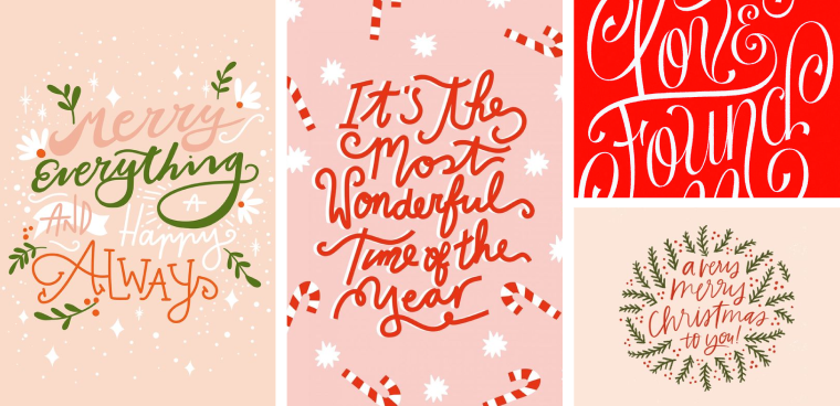
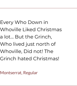
Typical Christmas typography with very low readability
In short, legibility means easy to read while readability means easy to understand. Furthermore, legibility is a component of readability, because your choice of typeface can create a better reading experience. So, think twice before downloading new decorative fonts for your festive design projects. Your message needs to be readable to all users.
03 readability
If it’s not readable, it’s not usable
1. Font styles that disappear
Very thin and curled letter serifs are common in decorative handwritten fonts.
That said, the thickness of letters is very important in web design where the text is displayed as pixels. Pixels are square shapes and they cannot simulate smooth transitions without aliasing. The thickness of so-called light, thin and hairline font styles are usually equal or less than 1px.
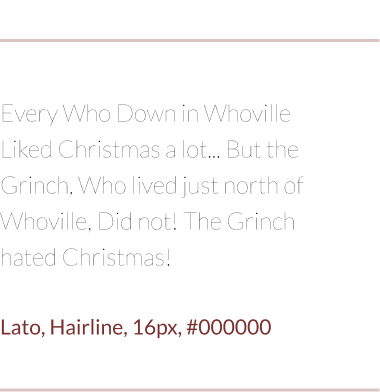
❌ Too thin
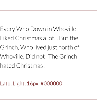
❌ Too thin
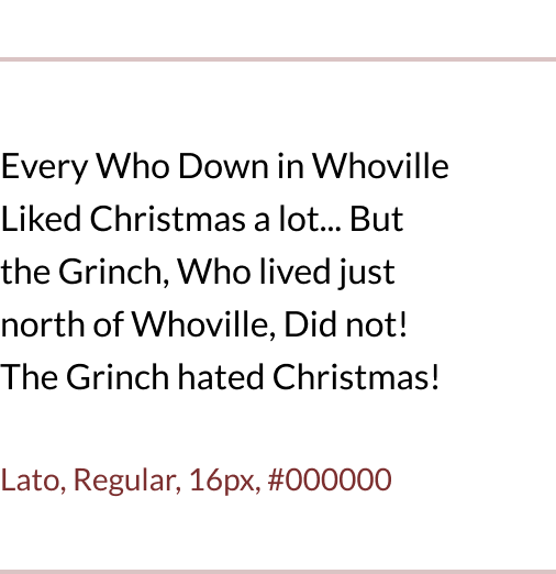
✅ Just right
Thin words can be very hard to read because they are, in part, visibly lost in pixels which make up the background for text, which makes the letters half displayed. To avoid this effect that can significantly reduce readability, try using the regular font style of your typeface.
2. Oblique shapes
To simulate handwriting, Christmas texts are usually slightly tilted to the right. Commonly used as an emphasis technique in text, oblique font styles bring new design challenges. Any skewed element that you have in your design will never be displayed as smoothly as you want.
Why? Because of technology that we work with.

❌ Not as smooth

✅ That’s good!
Let me explain more clearly. Drawing vertical lines on the screen is easy – the pixels stack on top of each other in a straight line. When drawing oblique shapes, the pixels are arranged diagonally. That’s the reason why, sometimes, the font style you chose, displays differently on various screens than on your high pixel density monitor. All in all, choose wisely when oblique shapes are in the game, especially if you pair them with small and thin shapes.
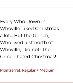
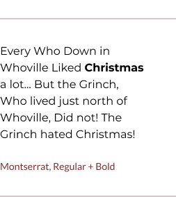
3. Decisions carry weight
Another important thing to have in mind, while designing with typography, is a contrast between textual parts. By switching the weight of your text, you are showing your readers what they need to remember, what is important and what is interesting.
You are establishing hierarchy and keeping your readers interested in what you have to say, so they don’t get discouraged by a big block of text.
❌ No contrast
❌ Not enough contrast
✅ Right amount of contrast
If we combine two font styles which are not so different in weight, such as Regular and Medium, you will not get a clear reading hierarchy. They are just too similar. Therefore, we recommend you use font style combinations that have a higher visual contrast, such as Regular – Bold or Regular – Black.
4. Icons and emojis
Today, the term font refers to all kinds of glyphs, including icons and emojis. Technically, the truth is a little bit different. Emojis are not a part of the font, not by default. They exist as a part of the operating system.
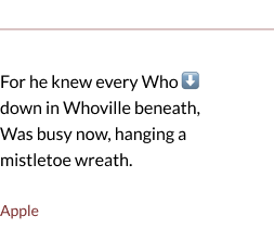
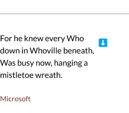
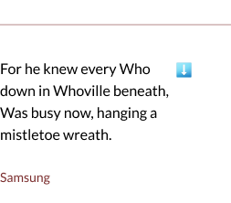
If you want to use an emoji to set the holiday mood, make sure that you use the right background color for your text. Different browsers on different devices display emojis – differently. For example, the blue arrow icon doesn’t come in the same shade of blue on each device.
04
Wait, typography can increase page load speed?
Are you familiar with that moment when you open a website, but the loading animation goes on and on, and you have to wait an eternity for content to show up? If you use fonts in your design wisely, you can improve user experience and increase page load speed.
These are little, but important technicalities you need to have in mind when setting up fonts for your design: number of font styles you use and their file size.
Number of font styles
Christmas is a time when everything is overflowing with luxury and riches. Many designers go overboard and they combine several typefaces at once, to achieve that feeling of luxury. They want to use the versatility of the different weights that each typeface has, but in doing so, they forget that – in the developers’ world – each font style counts as one font.
For example, OpenSans – Regular weights 217KB, and Open Sans-Bold weights 224KB. If you have another typeface with its own font styles besides these two mentioned, we’re talking about a significant increase of font file size. So, if you don’t want to mess up the page performances, use as few font styles as possible. If it’s not important for user experience to have multiple font styles at once, avoid unnecessary page loads.
Size of the font file
If you are tempted to download a very decorative font for Christmasy web design, pay attention to the size of its font file.


Typeface with texture and a lot of decorations consists of heavy font files which can slow down website displaying.
In order to increase page performances, try finding another, similar version of the font that has simpler shapes. If you still need to use that particular font for key visuals, I would recommend that during handoff, you export the key visual as an asset image.
That will make life easier for both developers and users who won’t have to wait long for the page to load.
05 CONCLUSION
When it’s all written and done
There’s something about good handwriting and lettering that never ceases to amaze. But it’s important to consider how the text feels as a whole, rather than looking at just individual letters.
In the digital era where users are buried in information, typography must draw them in, so that it can convey the message. In order for the people to read and understand it, typography also must – as Bringhurst wrote – relinquish the attention it has drawn. You don’t want to just have nice letters, you want them to mean something.
Type is a beautiful group of letters, not a group of beautiful letters.”
typography genius Matthew Carter